
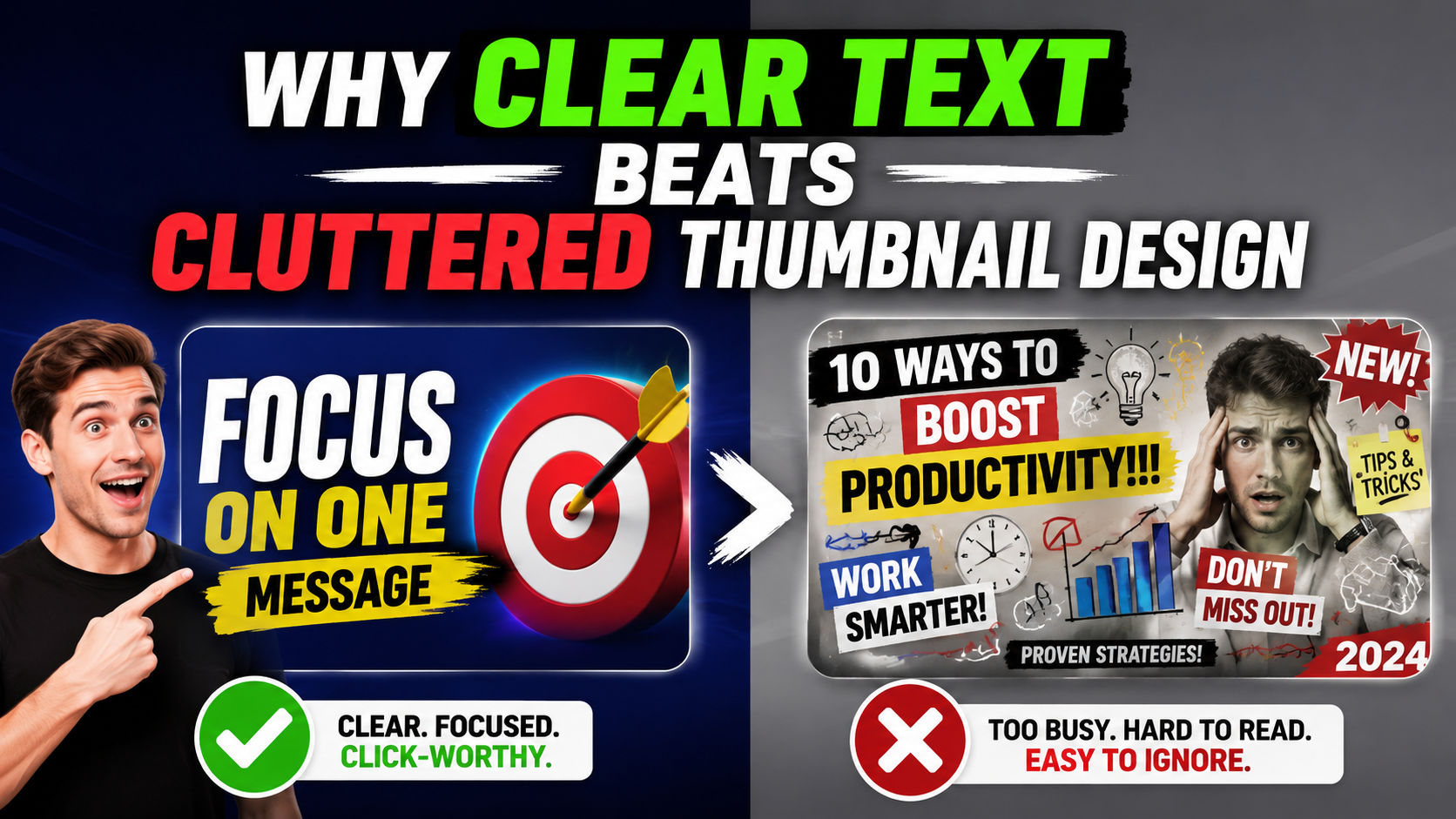
When a thumbnail is too busy, the viewer has to work. They have to decode the image, read tiny words, figure out the subject, and decide if the video is worth clicking. Most people will not do that. They will scroll to a thumbnail that explains itself faster.
Clear text is not boring
Clear text does not mean plain text. It means the words are short, readable, and placed where the eye can find them. A bold three-word phrase can feel more powerful than a clever sentence that becomes unreadable on mobile.
Too many words weakens the hook
If the title already explains the video, the thumbnail text should not repeat the whole title. It should add a hook. For example, “BAD IDEA?” can work better than “I Tried This Product For Seven Days And Here Is What Happened.” The thumbnail text should create curiosity, not carry the entire story.
Contrast matters
White text on a bright background, dark text on a dark image, or text placed over a busy scene will disappear. Strong thumbnails usually separate text from the background with contrast, shadow, outline, color blocks, or clean spacing.
One main subject is easier to click
Many cluttered thumbnails fail because they have too many “main” things: two faces, a product, a chart, five words, arrows, screenshots, and logos all competing. A better thumbnail decides what matters most and makes everything else support that idea.
Use a phone-size test
Before you approve a thumbnail, zoom out. If you cannot read the words or recognize the subject when it is small, the design needs to be simpler. Most thumbnails are judged at small sizes first.
Simple rules that usually work
- Keep thumbnail text to one short phrase when possible.
- Use a strong subject before adding extra effects.
- Make the text big enough to read on a phone.
- Do not place important words at the very edge.
- Remove anything that does not help someone understand the click.
Want a cleaner thumbnail?
Send the idea and we can turn it into a clear, clickable design.
cheapthumbnails.com makes custom thumbnails starting at $10, with optional extra variations if you want more than one text or layout direction.
Start order