
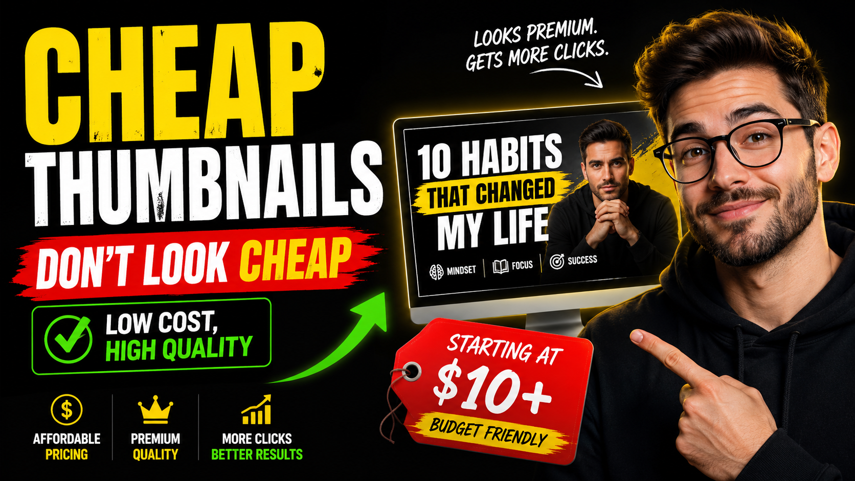
A cheap YouTube thumbnail looks cheap when the design has no focus. Too many words, tiny details, weak contrast, and random colors all make the work feel rushed. A low price can still produce a clean result when the thumbnail has a clear goal.
What makes a thumbnail feel professional?
Professional thumbnails usually have strong hierarchy. The viewer sees the main subject first, the text second, and the supporting details last. Everything is arranged so the eye knows where to go.
Where cheap designs go wrong
Cheap designs go wrong when they try to include everything. Every extra logo, arrow, sticker, phrase, and background element competes for attention. A better thumbnail removes what does not help the click.
How to help a designer move fast
Send the video link, channel link, references, people, products, logos, and a sentence about the main hook. If you do not know the exact thumbnail text, describe what you want the viewer to understand.
A focused brief keeps the price useful
Affordable thumbnail design works best when the job is clear. You do not need a perfect plan, but you should share the video topic, the audience, any must-use images, and what feeling the thumbnail should create. That keeps the work focused on the click instead of spending time guessing.
What is worth paying for?
The useful part of a custom thumbnail is not random effects. It is choosing what to show, what to remove, how big the text should be, and how to make the idea readable in a feed. A cheap thumbnail can still look premium when those decisions are handled well.
Cheap but clean checklist
- Use one visual idea.
- Use three to five strong words when possible.
- Make sure the design still works at phone size.
- Keep the format matched to the platform.
- Avoid decorations that do not support the click.
Simple and clean
Cheap thumbnails. Not cheap-looking thumbnails.
That is the whole point of cheapthumbnails.com. Order one custom thumbnail starting at $10 and keep the process simple.
Login to order